Handling layout & Flexbox
MOD CSS has its own flexbox-based grid system like most popular CSS frameworks based on a container, row and columns.
However, unlike others that use variables representing values, we use absolute values. You just have to set the width you want in %, px, rem, em, vw, vmax ... and this value will be applied.
On this, all props are set only on :mod/ or custom attribute. See examples below.
Container
Container is the main block who held the flex-content. The value sets correspond to the width of the container.
We recommend to set value in % in according of fluid design even if with MOD CSS, you can use "all CSS units".
<div :mod="container[100%]"></div>
Row
Row is a flex component who embeds the columns for displaying.
The value sets correspond to the width of the row. This value may be set in %, px, rem, em, vw, vmax ... or string "auto".
With value "auto", the width depends on its content (not recommended).
Row[value]
We set only width in this example
<div :mod="row[100%]"></div>
Row[value gap]
We set width and gap on this example. "gap" set row-gap and column-gap with the same value.
<div :mod="row[100% 12px]"></div>
Row[value row-gap column-gap]
We set separately width, row-gap and column-gap in this example
<div :mod="row[auto 1% 12px]"></div>
The gap is included in the total width of the row. Remember when you set it, to take this into account in the values of the columns.
If addition of values (columns + row-gap) exceed 100% of the width, the last column will be wrapped.
Row[fit]
In fit, width depends of its content.
It’s works on both row and column. Be carefully when you use it because you cannot control the real size of this row or column, this can display weirdly.
So, keep in mind that this works like width: fit-content.
<div :mod="row[fit]"></div>
Column
Columns build on the grid’s flexbox architecture. Flexbox give hability to choose how columns grow, shrink, for displaying ... and affect its behaviour depending screen size and in some others context.
The value sets correspond to the width of the coluumn. This value may be set in %, px, rem, em, vw, vmax ... or string "auto".
*We recommend to set value in % in according of fluid design.
column[auto]
In auto, column width get all remaining space. Per default, the max size of a column is set on 100%.
<div :mod="col[auto]"></div>
column[value]
This value set the width of the column. In %, you can set a maximum of 100%.
        <div :mod="col[20%]"></div>
        <div :mod="col[80%]"></div>
column[value offset]
We can set an additional value for offseting a column. This will set a margin on the left (an empty space) of the column, in according of value that you have set.
    <div :mod="col[15% 5%]"></div>
    <div :mod="col[80%]"></div>
column[fit]
The width depends of its content. Be carefully when you use it because you can't control the real width of this column, this can display weirdly.
So, keep in mind that this works like when you set width: fit-content.
<div :mod="col[fit]"></div>
Resume
Our grid based on flexbox have 3 main parts to work fine : a container who display whole block centered, a row like flex container and columns who held your components.
Simple Flexgrid
Our basic MOD flexgrid with two(2) columns is set like below
    <div :mod="container[98%]">
        <div :mod="row[100%]">
            <div :mod="col[25%]"></div>
            <div :mod="col[75%]"></div>
        </div>
    </div>
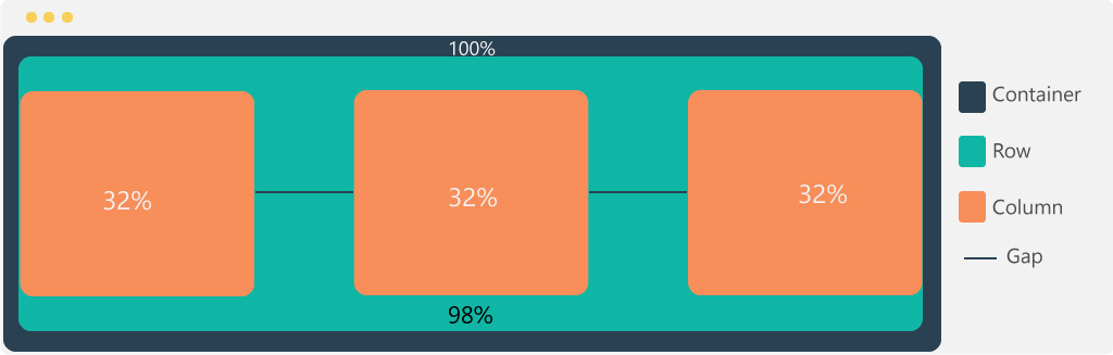
Flexgrid with gap
If you want to set a MOD flexgrid with three(3) columns with gap between them.
Each column take 1% of a gap. So, the row width (100%) includes 3% de gap in addition of column width.
    <div :mod="container[99%]">
        <div :mod="row[100% 1%]">
            <div :mod="col[32%]"></div>
            <div :mod="col[32%]"></div>
            <div :mod="col[32%]"></div>
        </div>
    </div>
Flexgrid with multi rows
So, you can use multiple rows to structure more precisely our conception.
You can use row and column in "auto mode" with offset.
You can set decimal percentage if you want.
    <div :mod="container[99%]">
        <div :mod="row[100%]"> //Row 1
            <div :mod="col[18%]"></div>
            <div :mod="col[82%]"></div>
        </div>

        <div :mod="row[400px]"> //Row 2
            <div :mod="col[fit 5%]"></div>
            <div :mod="col[200px]"></div>
        </div>

        <div :mod="row[100% 10px]"> //Row 3
            <div :mod="col[51.5%]"></div>
            <div :mod="col[22%]"></div>
            <div :mod="col[35%]"></div>
        </div>
    </div>
Set inside an another attributes New
With our lastest release, you can also define all properties above in any other MOD-CSS attributes and mixed them with any others properties.
In this case, you do it with adding $ to the end of each flexgrid property.
    <div :box="container$[55%]"></div>
    <div :box="row$[100%] co[orange]"></div>
    <div :var=".col-0{ col$[auto] h[10px] }">auto</div>